Tuesday, August 30, 2011
Monday, August 29, 2011
Week 8 Reading
This chapter was a great one to read this week as we start our phone app project (which I'm sure was your intention!). As a iPhone user, I have experience with both good and bad apps. And I also agreed with what the reading said about app design, especially the part about the app working with the OS to have the same motions and reactions that the OS users are used to. What I like about (most) apps that I get is that it is so obvious to me how to use them, because they all work basically the same, with the same motions that my iPhone uses. Also, because they all mostly follow these same rules, they are all similar in style and this makes it was easier to control the app.
I also liked the section about app icons and artwork. I think that this is a huge selling point when it comes to apps. I am definitely guilty of judging an app by its cover. I have generally noticed that apps with ugly or generic icons are usually not very good apps, because the rest of the app is designed just as sloppily as the icon. Also I think that people generally like their apps to look really cool because they spent a lot of money to have their smart phone, and they want their apps to match the polished look of their phone.
Aside from looking nice, the app also has to function correctly. Nothing is more annoying than downloading an app (especially downloading a purchased app) that crashes or does not load correctly.
I wanted to share some apps that I think work really great, and are designed really nicely as well!
(I obviously couldn't link the app directly to this blog, so I found some screenshots to share so that you can see what they look like!
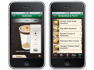
Starbucks
Of course, everything that Starbucks does is beautiful. But their app is very easy to use and the illustrative nature of the app totally matches the brand. I love this app and use it all the time!


I also liked the section about app icons and artwork. I think that this is a huge selling point when it comes to apps. I am definitely guilty of judging an app by its cover. I have generally noticed that apps with ugly or generic icons are usually not very good apps, because the rest of the app is designed just as sloppily as the icon. Also I think that people generally like their apps to look really cool because they spent a lot of money to have their smart phone, and they want their apps to match the polished look of their phone.
Aside from looking nice, the app also has to function correctly. Nothing is more annoying than downloading an app (especially downloading a purchased app) that crashes or does not load correctly.
I wanted to share some apps that I think work really great, and are designed really nicely as well!
(I obviously couldn't link the app directly to this blog, so I found some screenshots to share so that you can see what they look like!
Starbucks
Of course, everything that Starbucks does is beautiful. But their app is very easy to use and the illustrative nature of the app totally matches the brand. I love this app and use it all the time!

LinkedIn
I recently saw this redesign of LinkedIn's app on an online design blog. I love the fun, yet professional look of the app. Plus, it's super easy to use.

Halftone
This is a cool app that I recently discovered that allows you to turn the photos that you take with your phone into customized comic strips. You can take any photo, and add different comic book filters, paper options, color options, captions and more to your photo. This is a fun app that has a really awesome look and feel. Follows the comic book look all the way!

Monday, August 22, 2011
Week 6 Reading
I found this week's reading to be really interesting, and I have to admit, I have never really thought about web accessibility for people with disabilities. Now that I am thinking about it, it seems so obvious, of course people who are blind or have other disabilities would want to use the internet too, but I had never really thought about what we need to do as designers to make that experience more user friendly to those individuals. Also, I liked what the author said about making the web usable for not just people with disabilities, but also those who are not as web savvy as we are and may find something that we see as obvious to be very confusing. It makes sense to have a website design to have the ability to reach as many people as possible with its information, because the easier it is for one person to use it, the more people will ultimately become frequent users of the site.
Even for someone who is computer savvy, there are still sites out there that are confusing and makes the user unsure of what to do next. An example of this is when I went online to pay my garbage bill last week, using my local garbage company's brand new online bill pay for the first time. I chose to pay online to avoid the twenty minute drive to the office, or the usual ten or fifteen minutes I have to wait on hold on the phone until someone can take my call. When I got to the part where I actually pay my bill, I ran into a problem. I had my current bill and my due bill overlapping, making the payment double what I was due to pay this month. I selected to pay, and instead of taking me to a screen to ask how much I wanted to pay or letting me select an option, a pop up came up that only said "pay my bill" and a confirm button and a cancel button. I was unsure at this point what to do. Will pushing "confirm" bring me to the section I was looking for where I could select the amount I wanted to pay, or would it charge the amount for both months on the checking account I had already entered? I didn't want to pay double, and I didn't like the risk, so I ended up canceling and calling to pay my bill, which resulted in me waiting the usual 10 minutes and wasting all the time I had spent setting up my account online.
This really taught me a lesson about web usability and the necessity of thinking every step through and making it obvious to your customer about what actions they should take next, and that no matter how web savvy someone may be, if something is confusing, they will be just as lost as everyone else.
This week, I found some sites that had good usability that I think would work for everyone (or at least most!).
Verizon Wireless
I like this website because, as one of their customers, I have always found that they have the best and easiest online bill pay that I have ever used. I have never had a problem navigating through this site, and the fact that my Grandma pays her phone bill online through Verizon shows a lot about this site's usability.
Etsy
Besides being one of my favorite sites to "window shop", Etsy has a great and simple usability that I think would allow anyone to use and purchase items with little issue. When completing a check out process, Etsy shows you up front before you enter any information, to see the price of an item including it's shipping (unlike a lot of other sites) and that way there are no surprises once it is too late to go back without canceling your entire order.
Craigslist
Ok, so it definitely isn't the most beautiful site on the internet, but Craigslist has proven through all of its users that it is a site that is simple and easy to navigate. It is easy to find things and inquire about them through the seller, and it is simple to sell things as well.
Tuesday, August 16, 2011
Monday, August 15, 2011
Week 5 Reading
This week's reading on usability testing was really interesting and informative. I really liked how the author added the section about what actually happens during a usability testing situation, because I knew what usability testing was, but I did not know what should be said to the person doing the testing during the actual situation. I thought that some really good advice was offered during the two chapters this week. The author said that often times, designers do not like to share their unfinished work until they are at a stage of near completion. I think that this is a very true statement, and that I think I am often guilty of this as well. However, it is a good point to consider that the more people who look at your design early on, the more likely you are to find any issues quickly, and have the ability to make the necessary changes to the design before it gets to close to the end and you run out of time. I liked his idea to use the "cubicle test", which was the process of showing a sketch or draft of a design to the person in the cubicle next to you and getting their feedback. Although I do not have a cubicle, I think that this is a process that I could definitely start employing with my fellow students and teachers. I could even start showing more design work to people who are not in the design community to start looking at some of my in-process work because, at the end of the day, those people are the target audience for design. This was something that I had never occurred to me before. It seemed like showing my work to fellow designers was the best way to get a critique on something, and maybe even get some new ideas from them. But now I think that it is just as (if not more) important to show them to the people who will see them and not be able to break them down into techniques, styles, or any "design speak" like fellow designers can, and just simply see their initial reaction. All in all, I think that these chapters had great advice, and I will be utilizing this new advice from now on!
I think that the biggest frustration for me as a user, is the navigation portion of the site, and I also think that it is one of the most important portions of a site, and can easily become confusing. I found two sites that I think have great user experiences, and one that definitely does not.
Bed Bath and Beyond
This site has always irritated the hell out of me, due to its errors in usibility in regards to the menu bar. When you hover over a category, an additional subcategory menu comes out the side. And then another sub category menu comes out of that. When I went on the site today to link it to this post, I noticed that they now have an option to "turn menus off". Obviously, if they need to take the time to turn the menus off because people are so frustrated at them, they should just be removed.
Journeys
Journeys has a site that I think provides a really clear and user friendly user experience, even with all of the visual noise that is happening on the site. Whenever you hover over a link, it highlights yellow and in some cases, brings up a drop down menu, which stays there until you click away (unlike Bed Bath and Beyond) and gives great options to filter your search for the shoes that you're looking for. Even though there is a lot going on in the site, I think that it works well with the company's audience and the attitude that they have, and I think that they have a pretty well made website.
American Eagle
Besides the fact that I love all of the clothes that American Eagle sells, I also really love their website. I think that it is organized very well and has great usability. Instead of dealing with drop down menus that close if you hover too far away, American Eagle has everything listed in categories, so that the user can easily find what they are looking for. As you hover over the links, they are lit up to show what you are going to be clicking on, and that category remains highlighted so that you really know where you are. The shopping cart is located in the bottom right corner, and stays stationary even while scrolling through pages. I like this because I think that people will appreciate the fact that they can see their shopping cart at all times and can manage it more easily. I think that this site has great navigation, making it have a great user experience.
Tuesday, August 9, 2011

Project Statement - E-Commerce

Create a list of all users that may visit your site
Anyone who is looking to purchase baked goods online, for any celebration, who is old enough to order online with a credit card. People do not have the time or skill to bake their own baked goods, or go to a local bakery. They can save time by ordering online.
. What will each of those users want to see in order to enjoy their visit to your site?
Photographs of baked goods, ingredient lists, prices, special offers
. Name your intended audience
The working person who wants to have the quality of home baked goods, but no time to execute them themselves.
. Describe what you need to inform and persuade them of:
Promote my: Baked goods that are for sale
Goals of the site are: To sell baked goods, and provide quality product
My ultimate message/philosophy (about who you are): Our product will save you time, and will be enjoyed by whoever will be eating it.
What is the story you are telling? It is okay if you do not have time to bake yourself, because you can order quality baked goods from 1-800-bakery.com.
. Write a 200 word concept statement based on the user, your persuasion, navigation and the assets.
We want to create a site that is easy to navigate, full of high quality pictures of baked goods that drag people in without shouting at them, or overwhelming them with offers. The current site is too overwhelming and may push people away with how confusing it is. We want to make the site have better navigate and categorizing of information so that people can find what they are looking for easily, without being bombarded with every single offer that the site has at the time. Our user is a working professional who has limited time, or limited skills or space, to bake their own baked goods, but wants to enjoy a quality product either themselves, or as a gift. 1-800-bakery.com will provide just that! The quality of the product makes the price worth it, as well as the time you will save. The current site has a lot of problems that are overwhelming the customer, with pop-up windows and surveys, links and drop down menus that do not work, and a lot of information at once. We will redesign the site to reflect the ease of ordering and the convenience that 1-800-bakery.com will provide.
Week 4 Reading
This week's reading was about home pages and how to make them the most effective. I think that this chapter was very helpful during my analysis of my e-commerce website design. The website that Whitney and I chose to do for our e-commerce redesign has the most horrible homepage ever. It has so much going on, and the viewer has no idea where to look first, or where to go to find what they are looking for, and that is why Whitney and I chose to redesign 1-800-bakery.com.
I think that the homepage is the most important part of a website because it tells the user what their experience is going to be like. For example, with 1-800-bakery.com, the user's first experience with the site is a bunch of crazy boxes with different offers in them, and with that first experience, the user will feel like the whole site would be confusing and full of information that will be hard to navigate.
I found some sites with really horrible homepages (including my e-commerce site!)
1-800-bakery.com (for obvious reasons!)
walmart.com (I know that this website is actually pretty organized, but all of the scrolling words, pictures and flashes of video makes my head hurt!)
And, strangely, I think that webpagesthatsuck.com has a pretty crappy homepage, and all the blue links make me not even want to explore the site further.
Monday, August 1, 2011
Dear Whitney Mack,
Since I am still on vacation and have a lack of WiFi and am on my mom's tiny tiny netbook trying to finish my homework, I thought I would post some e-commerce sites that I found for our next projects. Just found some ideas for our redesign so that I could feel like I'm contributing!
I found:
80stees.com
ediblesincredible.com
1800bakery.com
bakerydelivered.com
Just some ideas, I'm sure you found some too. Don't really care what we do, just let me know what you want to do!
I found:
80stees.com
ediblesincredible.com
1800bakery.com
bakerydelivered.com
Just some ideas, I'm sure you found some too. Don't really care what we do, just let me know what you want to do!
Week 3 Reading
Even though this week's chapter about navigation was VERY long, I found a lot of the information very interesting and very important to learn. What I really liked about learning so much about navigation was that, even though the author of our book focused on website interfaces and their navigation, I thought that a lot of the information could be applied to print work as well. It is all about putting information in places where people will easily see it, and easily be able to go back, and easily know where they currently are. I have seen many websites where the navigation is very unorganized and hard to figure out. Also, I hate the search bars on some sites, because you never find what you're looking for. But I found when I was designing my portfolio site that navigation is the hardest thing to design in a website because if the navigation is bad or confusing, the whole site is rendered useless, no matter how "pretty" it is. I think that putting the focus on the navigation is the most crucial point, and should be priority number one when creating a website. As I said earlier, the same priniples can be applied to print design, because the whole idea is getting information across while looking well designed and beautiful. If the information is hard to find, or is confusing, just like a website, it will be rendered useless.
In the spirit of our upcoming e-commerce project, I found an e-commerce site with good navigation.
1-800-flowers
In the spirit of my current vacation at the beach, I looked at the Malibu Rum site and found I liked it's clear and simple navigation
Malibu Rum
I also think that Expedia's site has really clear and concise navigation
Expedia
Personal Site - Case Study
Still gone away on vacation this week, so will not be in class. But here is my final case study for my personal site.
Subscribe to:
Posts (Atom)